Objective
The Executive Integral Leadership Institute had been running for more than 10 years and in 2013 they decided to rebrand.
It was impossible to differentiate their programs they offer among them and from the competition. They didn’t have a visual image and they communicate at the same time with different concepts as nature or business sceneries.
alétheia
The most important goal was to choose a concept: nature. Developing the brand basing on nature would allow IDDI to be unique in the coaching field. The differentiation between two specialities was essential, so that the client could attend either dialogic coaching or executive programs.
I used the colors of the forest and the ocean to display their catalog of courses. IDDI logo would be just in the middle: bluish-green.
Position played: Lead Graphic Designer
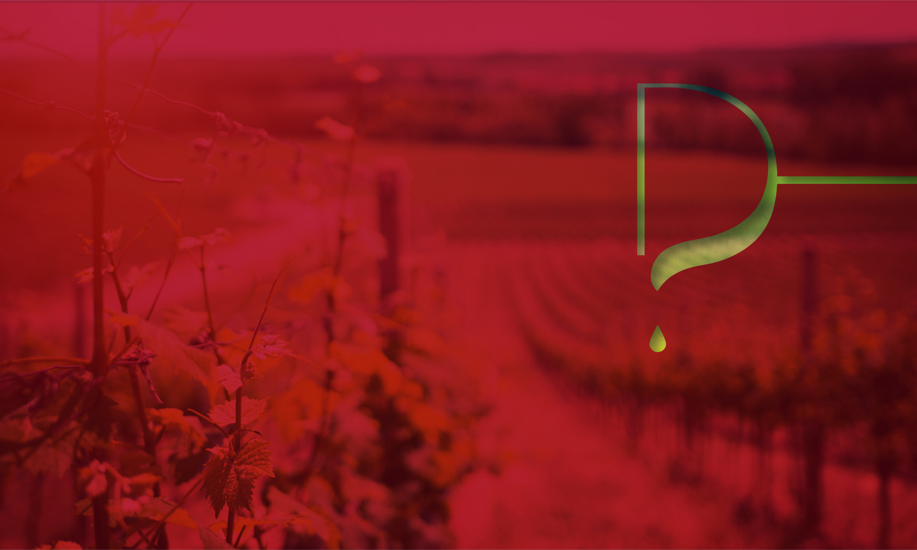
I chose a color spectrum to each of their courses and associated a landscape to be their own image.
This photograph will be used in all the graphic pieces of that course.
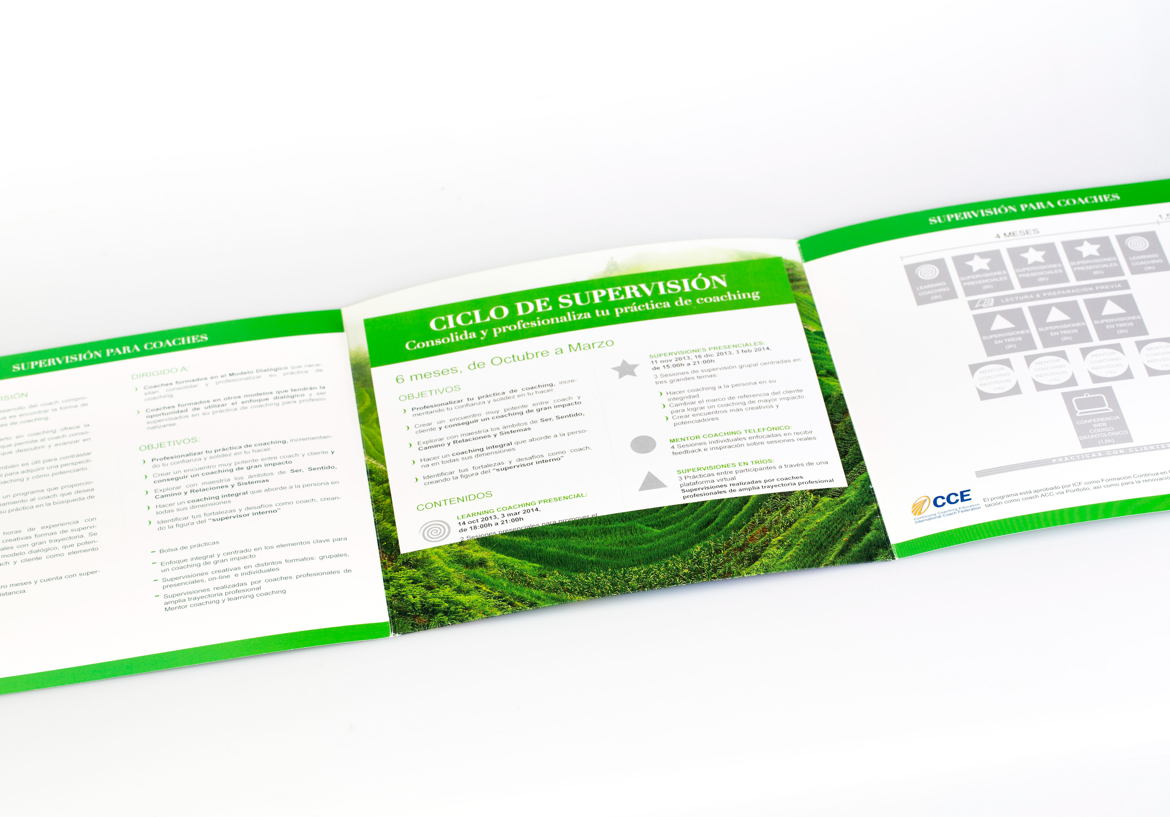
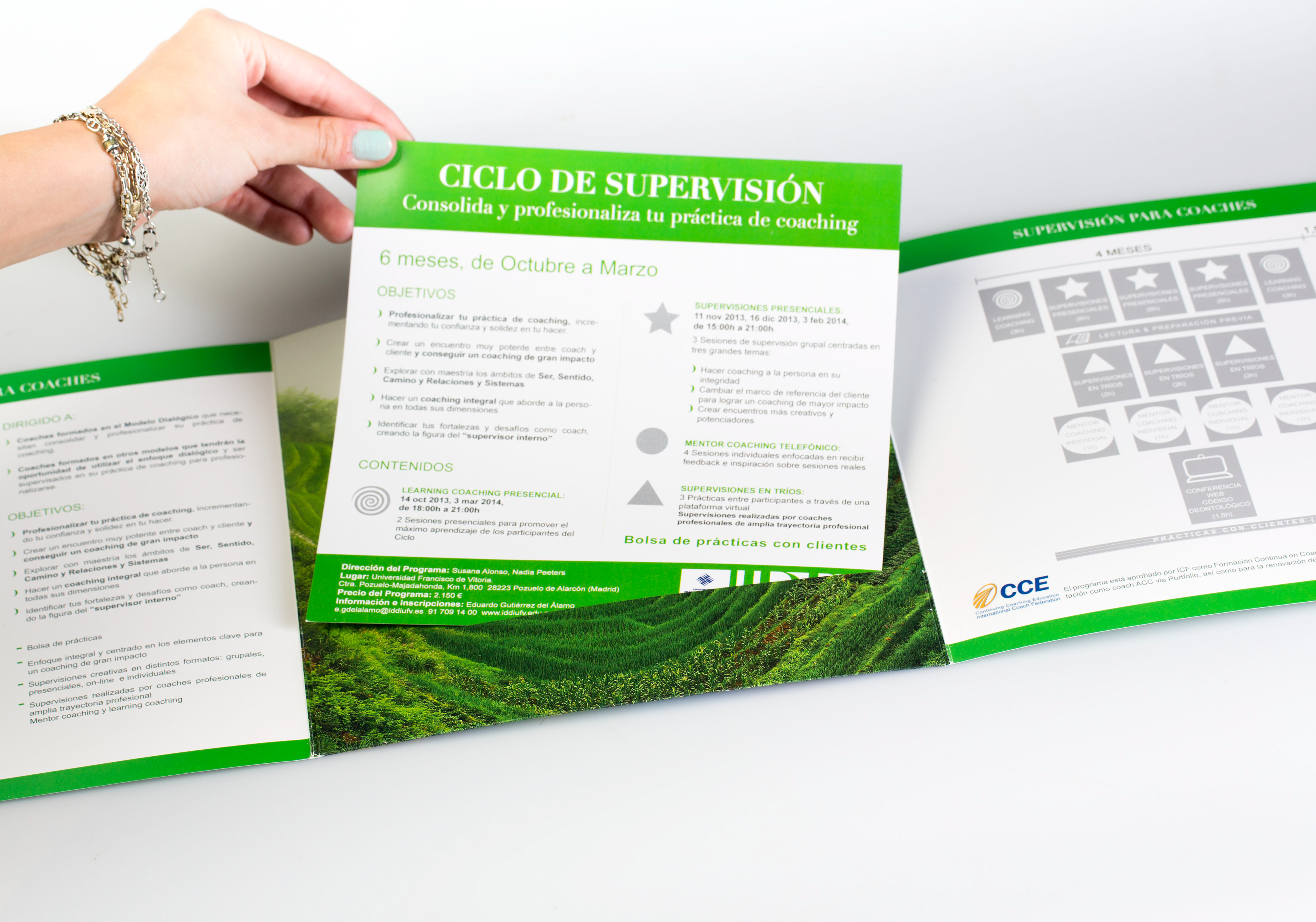
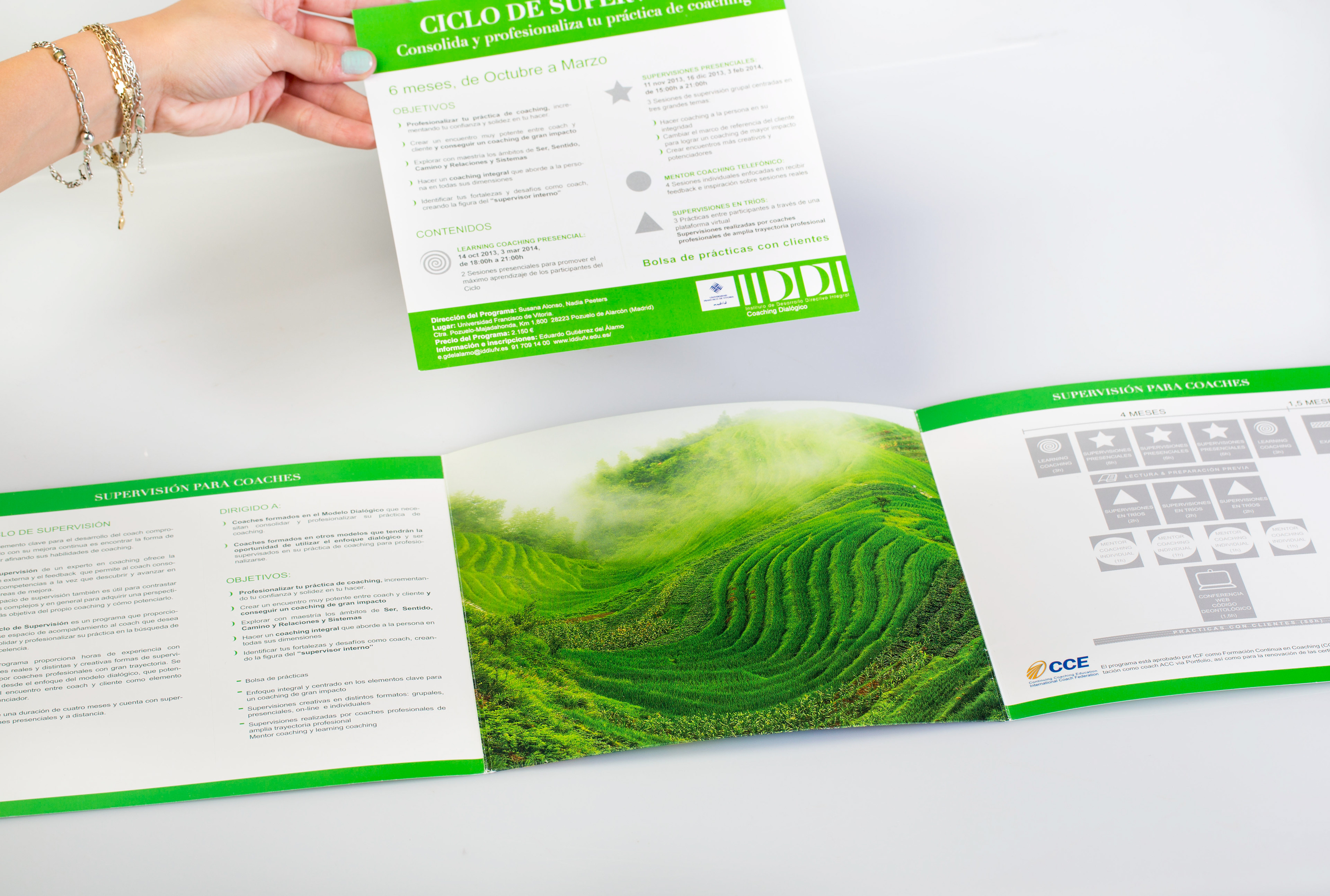
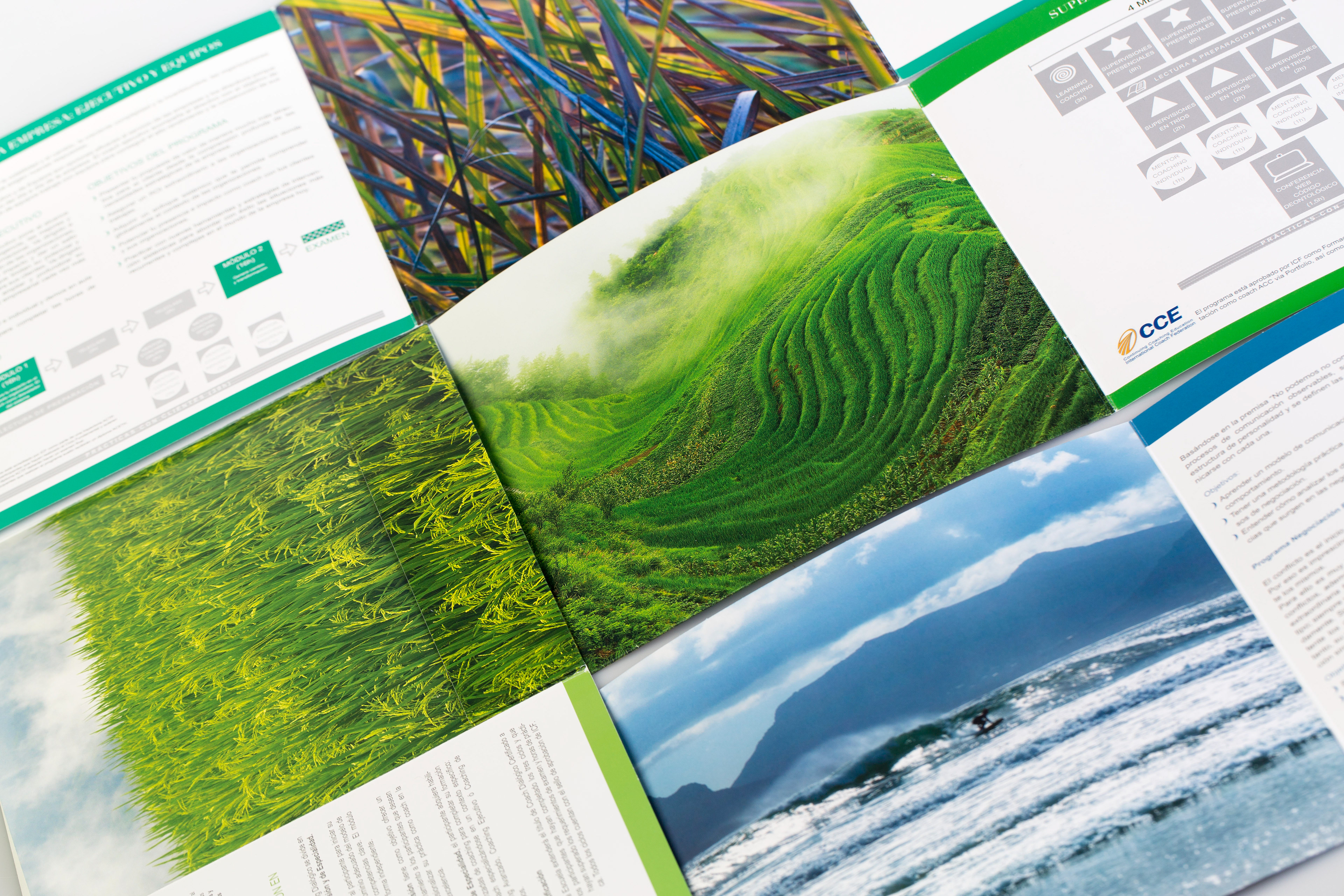
I designed a brochure for all the programs, a clean and colorful design that would help differentiate the course you are interested in and also be unique in the coaching field when assisting fairs and congresses.

