Objective
The International Culinary School Le Cordon Bleu wanted to develop a new education branch, adressed to the training of the workers template.
They already were the best training chefs, but their goal was to extend that philosophy and those values to all the people that belong to a restaurant.
They had a name, and they needed a brand which coexisted with theirs but at the same time could be distinguisged from it.
alétheia
The main idea of this project was to give the comensal a full experience, so that everything was enjoyed: not only the food, but also the way the client is welcome, accompanied to the table or served.
With this premise I developed a brand that highlights all aspects of the eating momento. I used the circle as a common element in a saloon, tradition and the slogan Beyond the cuisine to shelter the logo.
Position played: Lead Graphic Designer
"The bull’s eye is the point between the kitchen and the saloon, where magic happens"
It was important to maintain coherence with Le Cordon Bleu brand. It is a brand created based on The Holy Spirit House in 1578 in France and the excellence it used to represent.
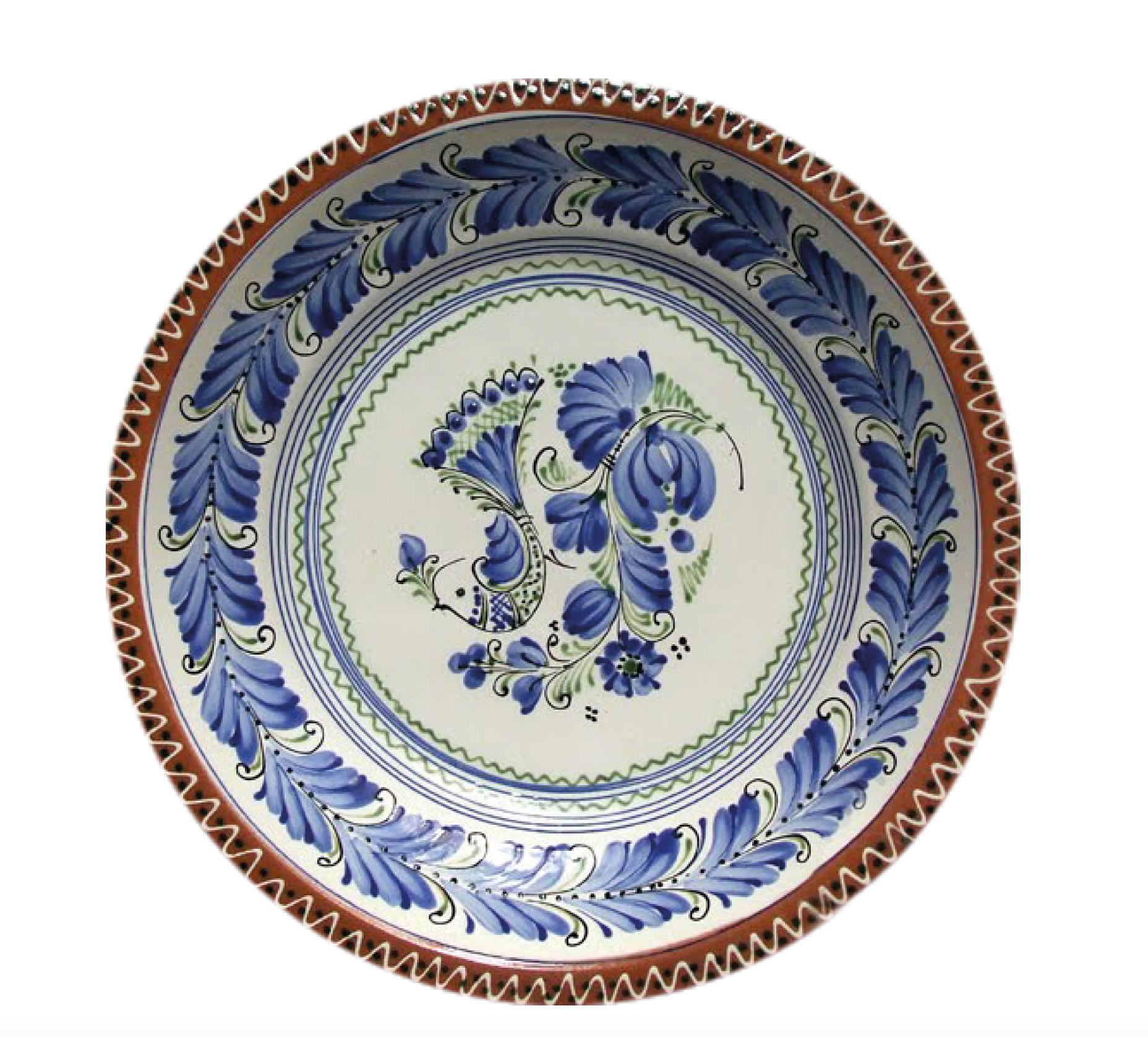
I found the circle as a common sign in all the moments and people that belong "beyond the cuisine": the barista, the sommelier, the waiter, the bartender... and of course, the plate where food would be served.
It was also used the traditional shapes of plates from XVI century to create the logo.


Nowadays, the logos of Le Cordon Bleu and Le Cordon Tec coexist and restoration courses are offered to students from all over the world.

